Data & Science — Data viz · Frontend · DSP · Science communication
↗ RepositoryA Fish Story
Interactive scrolltelling piece translating a scientific paper on Marine Protected Areas into a data visualization experience.
Context
Climate change discourse is dominated by what we must stop: stop pollution, stop fossil fuels, stop emissions. That framing is true but incomplete — and in practice, it paralyzes more than it mobilizes. Real systems have inertia. They do not stop overnight.
After years working in sustainability and sharing space with activists, politicians, and conservationists, I became convinced that lasting change comes from making good practices so compelling and effective that bad ones become obsolete — not from shaming people into stopping.
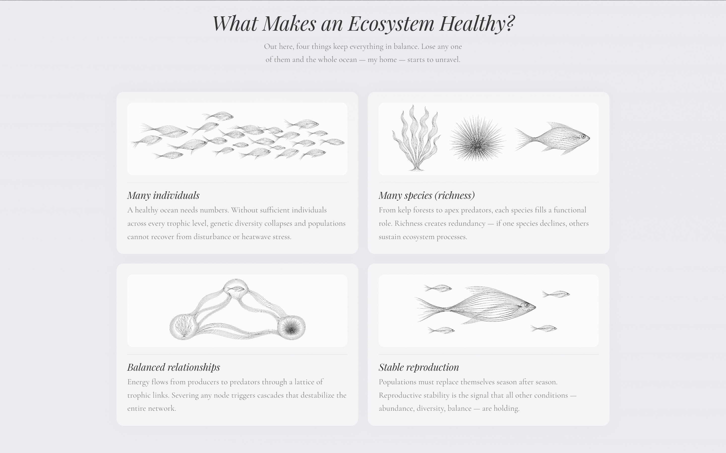
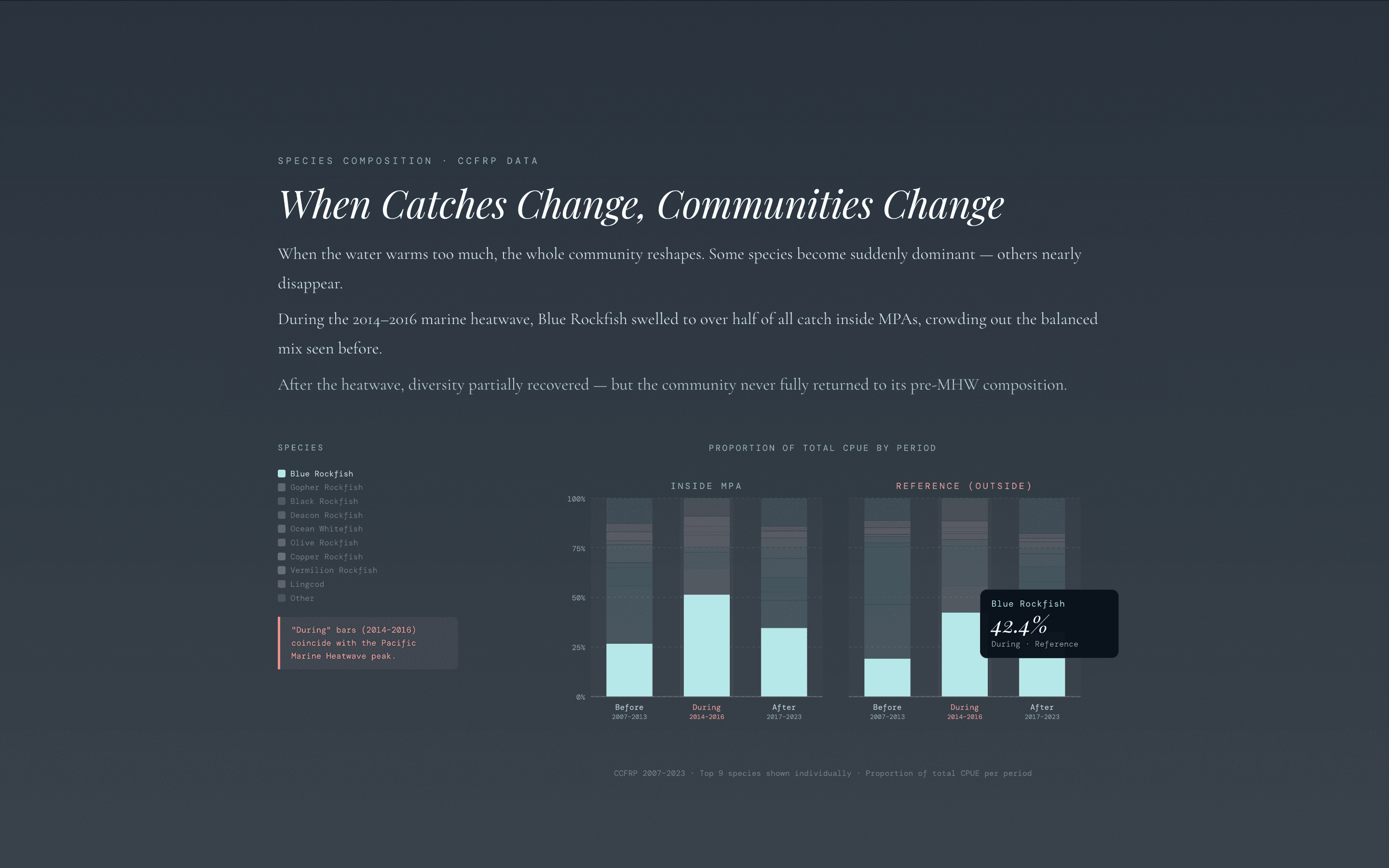
A Fish Story uses a first-person scrolltelling narrative to visualize the positive impact of Marine Protected Areas (MPAs) during extreme weather events. Climate change is already here. But we already have tools to adapt — MPAs give marine ecosystems significantly more resilience when heatwaves hit. The story makes that argument visually and emotionally, not just statistically.
Technical Detail
- —Data work: source dataset cleaned and processed in RStudio. Visual composition and layout planning in Affinity Designer before any code was written.
- —Web layer built with D3.js for all data-driven visuals. Scroll position controls application state, triggering both visual transitions and audio events across 7 narrative sections.
- —Stack: Vite + React + Tailwind CSS. The scrolltelling architecture separates narrative sections each with their own data visualization layer.
- —All visual elements are grounded in real, peer-reviewed datasets — no illustrative approximations. Using official datasets requires significant cleaning work, but it is non-negotiable for science communication with integrity.
Learnings
- —D3.js has a wide range of affordances, especially combined with scroll-driven interaction. It stops being a charting library and becomes a spatial storytelling tool.
- —The most important insight: humans do not make decisions from data alone — they respond to stories and emotional experiences. A number showing MPA resilience is forgettable. A first-person narrative that puts you inside that ecosystem is not.
- —Data discipline: extracting only what is necessary to communicate the essence — that MPAs increase ecosystem resilience — sharpened the whole narrative. More data is not always clearer.
